Today, Facebook is unveiling its first News Feed redesign in over a year and, earlier this week, they began testing a new-look Timeline. Google has beaten its rival to the punch, having released a new Google+ profile page earlier today.
The first thing users will notice when they go on their Google+ profile page today is a prompt to update the cover photo. Cover photos are now a lot bigger than they were before, up to 2120px by 1192px and displaying in 16x9.
Profile photos are now circles instead of squares, but they still sit in the bottom left-hand corner of the cover photo, remaining roughly the same size as before. The new cover photo provides businesses and individuals with a larger canvas on which to personalize their page and promote their brand.
A “Reviews” tab has been added to the toolbar, where users can post reviews of local places and highlight their favourite restaurants. The Reviews tab can be hidden using the Google+ settings.
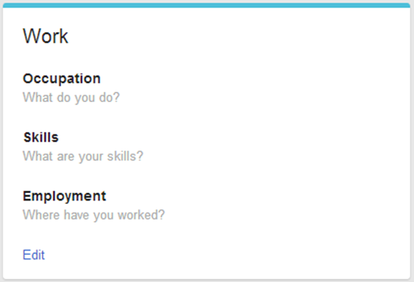
Finally, the “About” tab has been updated, so each section is clearly separated. People, Story, Work, Education, Basic Information, Places, Contact Information, Apps and Links are all in distinct boxes. Users can easily edit each box thanks to an “edit” link at the bottom.
According to the announcement post on Google+, the updates will be “rolling out gradually”.
Do you like the redesigned Google+ profile page?


1 comments:
Wе stumbled over hеre frοm
а different website and thought Ӏ might check
thingѕ οut. Ӏ liκe what I see so nоw i аm fоlloωing you.
Look foгωarԁ to going oveг уour wеb page for a
second timе.
Мy web page self storage in solihull
Post a Comment